

RAYMOND OGLESBY @RaymondOglesby2
September 9, 2021
If you take advantage of Excel’s charts for helpful visual displays of your data, check out the People Graph option to create a simple depiction of the number of people or items you have logged in your spreadsheet.
This is for devices running Excel. Screenshots are from Excel for Office 365 and Windows 10.

You can display things like the number of visitors to your website, downloads of your app, sign-ups for your event, calls to your support center, and much more.
Add People Graph Add-In
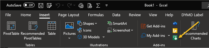
People Graph is an Add-In developed by Microsoft, and there’s already a button for it in your Excel ribbon. But before you can use it, you will have to trust the add-in to install it. First, open the Insert tab in Excel and look for the Add-ins group. Click the button for People Graph. Refer to below image:
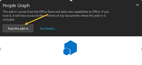
Next, You will see a pop-up window with a link to See Details. This takes you to the Add-In on the Office Store, where you can read an overview, reviews, and other details. Click Trust this add-in to get started. See below image:
Now, once the add-in is installed in Excel, you can click the button on the Insert tab to use the feature.
Insert a People Graph
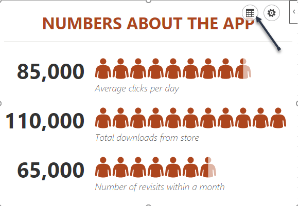
Whenever you hit the People Graph button in the ribbon, you will see a sample graph. First. click the Data icon that looks like a small grid. See following image:
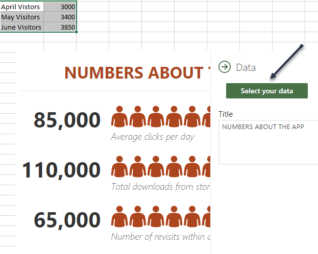
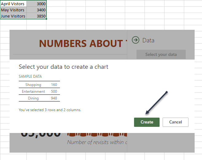
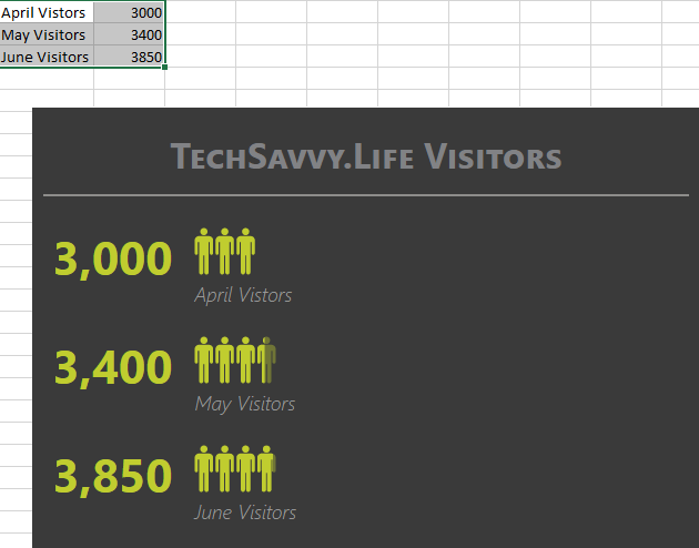
Optionally, you can enter your graph Title before selecting your data, or you can just head back to this spot to add the title later. Next, click Select your data, and then drag through the cells that you want to use. Currently, you must use two columns of data, but you can have multiple rows. Refer to below image:
Now, click Create on the People Graph screen. See below image:
Customize Your People Graph
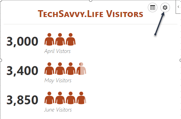
First, click the gear icon to open the Settings. You can then move through the three settings for type, theme, and shape. See following image;
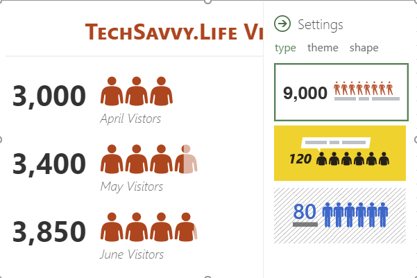
You can currently pick from three graph types. Each has a slightly different layout and appearance. Now, click Type, and then choose one on the right side. Refer to below image:
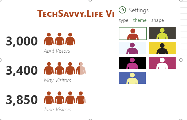
Next, you can select a Theme that changes the background and colors of your graph. Click Theme, and choose one of the seven options. See below image:
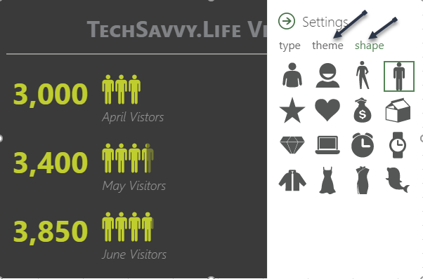
Finally, you can use a different Shape. So if your data is better represented by a Shape other than people, you can choose the best fit. Now, click Shape and pick from the 16 options. See following image:
Next, you can select and drag your People Graph wherever you want it on your spreadsheet. And if you edit the data on which the graph is based, Excel will update the graph automatically. Refer to below image:
Other Options
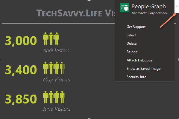
On the top right of your People Graph, you will see an arrow (Windows) or an Info icon (Mac). When you click, you will see several actions .Choose Reload to refresh the graph, Delete to remove it, and Select to select the graph if you want to move it. You also have options to Get Support, Attach Debugger, and view the Security info. See below image:
If you are looking for a simple way to visually display data, especially if it includes a number of people like customers, clients, or contacts, try out the People Graph in Microsoft Excel.
Quote For the Day
If you don’t like what you’re doing, then don’t do it
Ray Bradbury
That’s it. Please feel free to share this post! One way to share is via Twitter.
Just click the Tweet icon below. This will launch Twitter where you click its icon to post the Tweet.
Check out TechSavvy.Life for blog posts on smartphones, PCs, and Macs! You may email us at contact@techsavvy.life for comments or questions.
Tweet
I Would Like to Hear From You
Please feel free to leave a comment. I would love hearing from you. Do you have a computer or smart device tech question? I will do my best to answer your inquiry. Just send an email to contact@techsavvy.life. Please mention the device, app and version that you are using. To help us out, you can send screenshots of your data related to your question.
